Histogram analytics is a methodology that models transactional data on anything that goes through multiple processing steps (sequential/parallel). We can leverage it by generating Histograms for each step at each cycle time, and then generate a path table which shows the transition of each step with certain probability. These transition probabilities can then be aggregated using a certain set of rules to accomplish the following:
- Location of items: current or last known location of all items of interest – effectively identifying the step or queue within the path / channel. This metric is used with cycle time, yield, and path selection models to establish the boundaries for prediction.
- Quantity of items tracked into the current step (used with yield model for predicting output quantity).
- Time of last event (used with cycle time model for predicting completion time).
Some use cases where Histogram analytics can be leveraged include:
- Supply chains that involve goods to be moved through a series of steps before reaching their destination. (i.e., production, packing, transportation, warehouse, shelve)
- Manufacturing that involves a series of steps to convert the raw materials to finished goods.
- Airport security clearances where a person must go through multiple steps before they board the aircraft.
Histogram Models Overview
The semiconductor manufacturer NXP provided a step-by-step definition to identify a partflow number based on the combination of {site, technology, techcode, part, stage, eqpType}. Intel provided the same based on { LOT, WAFER, Entity, and LOCN}. We then created a table to extract partflow numbers and to filter out only lots that are in production.
The table and its underlying data is then used for building histogram models.
For each of the steps, we built histogram models for Step cycle time, Queue cycle time and Process cycle time:
Step cycle time (metric='sCT') – time taken by a lot to complete the entire step from arrival to finish of processing
Queue cycle time (metric='qCT') - time spent waiting in a queue for processing a lot
Process cycle time (metric='pCT') - time required to process the lot by the machine
the process was used to build histogram models of the cycle time by machine process time (pCT), queue time (qCT), and total step time (sCT = pCT + qCT).
The SQL for building the models include the following:
- Data limits are computed based on Tukey outlier limits - we calculated the upper quartile (Q3) and lower quartile (Q1) to smooth the tail of bar graphs, making the histograms close to a normal distribution.
- The actual models are stored as binary objects (BLOBs) in the database.
A Tukey limit is the limit to remove the outlier based on quantile. Anything below Q1-1.5(Q3-Q1) or above Q3+1.5(Q3-Q1) are considered outliers, where Q1 is the first quartile and Q3 is the third quartile for distribution.
We can get different insights from different cycle times like queue cycle times which can tell us where in each step there is a bottleneck that is affecting the total time or total performance.
Path Table
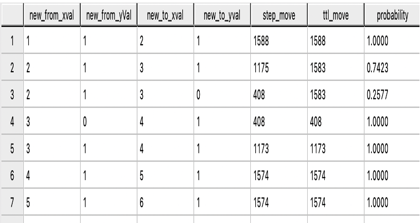
The path can be considered as a roadmap to reach the evaluation step, traversing from step to step to reach the destination. Weight on the path can be considered the cost of traversing from one step to another, regardless of previous and future steps. We have termed weight as probability of splits and aggregated those probabilities with a rule-based approach to compute the total cost of the path.
A full process model would show all likely paths from start to end, including multiple parallel paths, multiple skips, holding locations, and reworks. The process flow is derived from tracking an item through the process. This is conveniently done with NPath on the event sequence as some steps are skipped. Then NPath is used to track lots through the steps.

The Teradata Npath function was used to generate this path table:

Projection
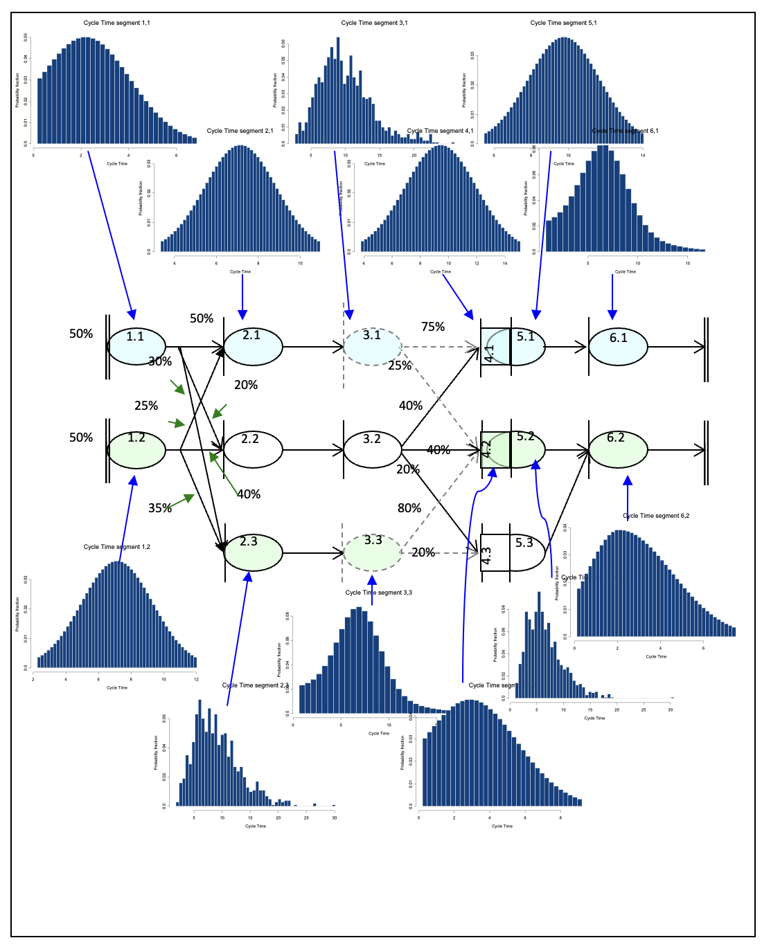
With the path table and the models, projections can be made from any step to any other step. Projections consist of combining a pair of histograms at a time, resulting in another histogram.
They are either combined in a serial fashion (e.g., Step 1 then step 2 -> combine model for step 1 with step 2 in a serial combination) or a parallel combination (e.g., step 2 or a parallel path that skips step 2). In this case, a parallel combination is used to combine the histograms, with the probability of each path specified.
The stored procedure was made for the projection as we start from the last step and combine all the histogram models and aggregate their probabilities from end to start based on certain conditions. Histogram models are continually added on in a series, as per the path table, until we have a merge point and a split, which is when we combine the split path in parallel and multiply their respected probabilities. The steps were repeated until we have a final aggregated histogram – a combination of all the steps – which can then be used for further calculations.

This figure is from a primer document of histogram analytics.
Computing Statistics
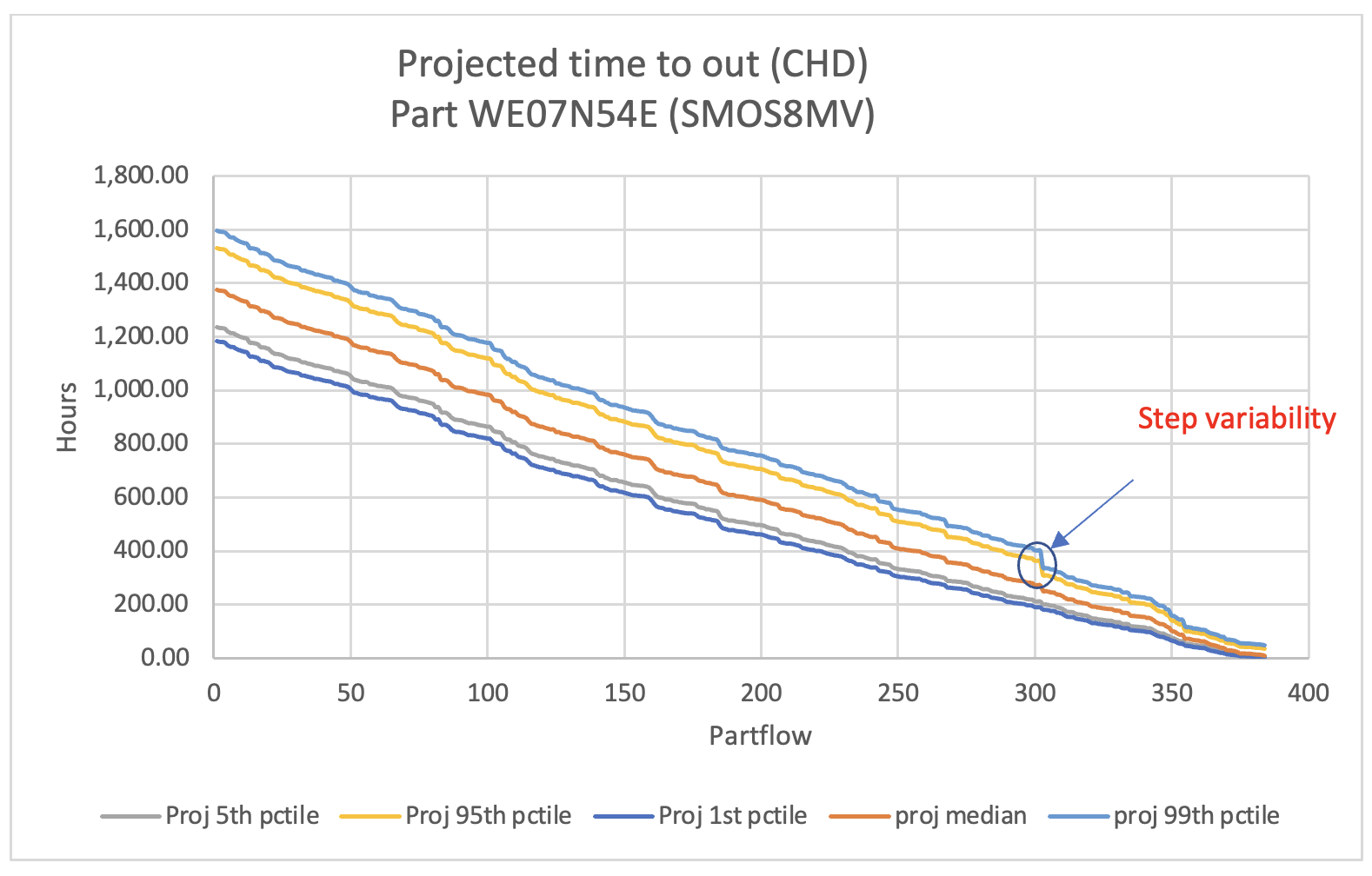
After the projection of the final histogram, certain calculations are required to examine the variability and bottlenecks. SQL UDFs were used to compute different percentiles of the final histogram, and results are used to draw the variability graph.

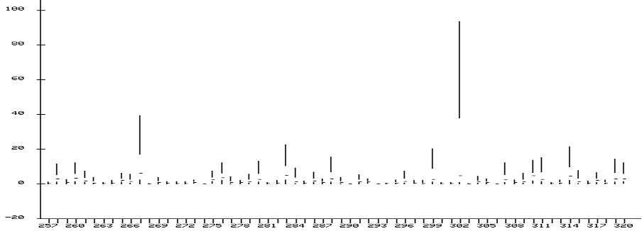
The user can see in the graph and examine that step 302 has some uncertainty which can be investigated further at the hardware level (manufacturing machine, etc.). The same can be confirmed through the box plot where we can see that step 302 takes the highest queue time.

All the statistics and calculations are performed in Teradata Vantage. Total steps in our case are 384, so only 384 rows were extracted for data visualization, but this can be scaled to larger datasets.
Key Takeaways
- Proven patented methodology to predict cycle time in sequential events
- Entire solution runs on Teradata and hence prevents data movement
- Extremely scalable solution

